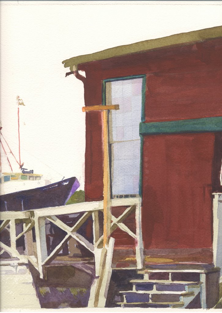
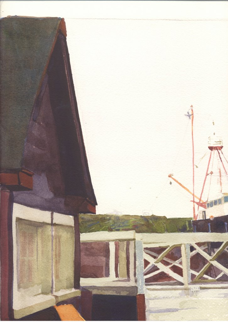
I have been painting a picture of the ship at John's for about 2 weeks. See two halves above and good luck connecting them with your eye. It's too big to scan. The copy above is from a few days ago.
I've decided it may help to write about trying to make it work. Within the first couple days I wanted to quit. I didn't like it. But David said finish the painting. So I stayed on the project.
It is two ramshackled buildings on the Maine coast with a ship in the background between them.
I saw improvement when I painted in the dark behind the fence which links the two buildings. That gave me the architectural footprint I meant to start out with but
got distracted from.
The fence became a challenge which I did not draw correctly and had to go back and erase and repaint parts. Then there was the window with the odd post in front of it.
The ship looked nice in the background but I didn't like the surface of the two buildings.
I wanted color and shape balance, but all I could see was a lot of gobbledy gook and tons of fussy details. Fussy is not one of my values in painting though lots of average people love fussy details in watercolor and would pay for it.
Once I had a significant amount of fuss in the painting, I decided I could not hurt it by finishing it with more fuss.
Now it is almost done and it's too big to scan. Actually I can scan about half of it at a time and I did at a certain point.
I would have liked it better had I stopped and not put in more lines and wires going to and from the ship.
Soluntiions:
The red building looked awful. It had a dark green accent on it which made it great fodder for a painting, but the paint job I had done looked sloppy and flat and boring. I added dark shadow under the eaves. I kept looking at the photo. Finally I decided to try putting in the details of the boards that made up the side of the building. What have I got to lose. So I mixed up more red brick colored paint and took a flat brush and made strokes leaving a tiny lighter space between strokes. When that was dry I put some dark marks where the boards met the corner of the building. Then I did the same with the wider boards of the open door. It is looking more realistic all the time. If I cannot finish it in suggestive shapes and balanced color, I may as well finish it in fussy detail. At least it will get finished.
My pallet looks a mess and my paints keeps trying to dry up on me because I keep jumping up to do this and that (eat lunch, let the dog out, let the dog in, make coffee, answer the phone, go to the bathroom).
There is dog hair everywhere including in my paints. She lies at the end of the bed and often takes my spot when I get up to do an errand. She wants to know why we haven't been out for a walk for a week. I tell her I'm sorry but I hurt my knee and doctor says rest.
There are places where the edges are crisp and the detail is correct. And there are places where I had to much paint on my brush and the lines are wobbley. There are place where I erased by lifting pigment with water and paper towel.
I have a post card sized version of this scene and I like it a lot, but I have not been looking at it for several days. Yesterday I found my online copy of it and doctored it up -- experimenting with lines, paintbrushes, erasers and airbrush. I saw some interesting effects and tried to save it but it did not save.
I want to get out books and look at landscapes and find what I could do to my painting that would redeem it.
I darkened the fence with cerullian and Verditer blues to tone it down. It was too white for a rainy day and a dirty old fence. The blue tied it in with the blue of the window in the red building.
Then there is that white board in the front and center. Would the picture be better if I totally painted it out? It is interesting to me that the paint I put down was minimal, but now I can tell it's a dirty old white board hinged to the fence.
What's next? What do I need to do to finish it? If the texture of boards helped the red building, then will texture help the green roof on the left side? Again it can't hurt to try because this painting was long since given over to fussy detail.
I keep thinking of the critique at which Christy said "I am trying to dig myself out of a very deep hole." I did not see what the hole was that she was digging out of, but I observed that though she did not like what she had started in her painting, she was staying with it and finishing it.
I just know that the average joe might look at this work and like it BECAUSE of the fussy detail. It does not hurt me to practice this skill of accurate copying of what I see. This makes me remember again my teacher's words: Every once in a while you have to draw really well. He said that a few times this year in class.
I know he's not referring to fussing, but still I need to be able to draw really well, so on we go, finishing this painting with realistic touches. At the same time, I keep looking for color balance and I think I need another master class or two to understand how David does it. I look forward to finishing this picture and not having to look at it any more. I think it will look better framed and on the wall.
10 a.m. Time to get back to it.
No comments:
Post a Comment